Making of my darlings
I will tell you here the story of a drawing; from the commission till the finished product.
During the last months I have been working on several motifs I have licensed to the company Ritzenhoff and this is the making of one of those motifs. Of two of them, actually. Step by step.
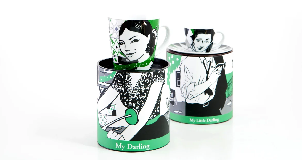
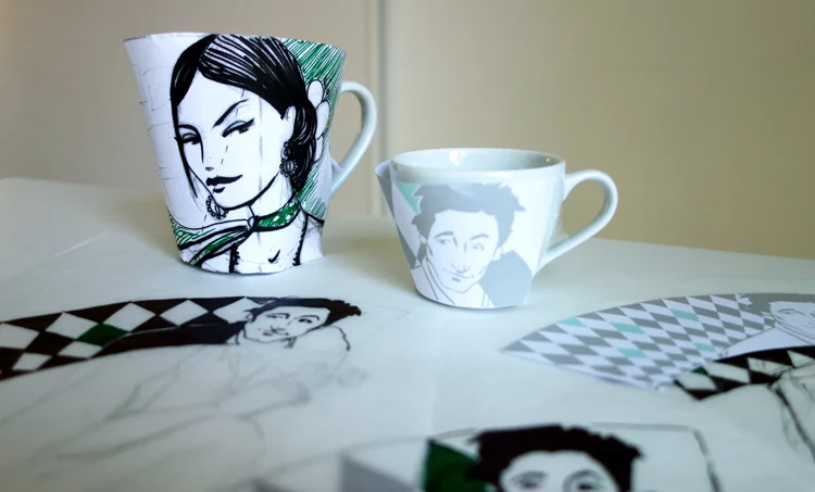
First of all is the brief: in this case Ritzenhoff told me the motifs would go on a cappuccino mug and an espresso cup, the decoration on the cups should be the head of a character and the packaging would be its body, they gave the theme, which was "Caffè di Roma" and a very good mood-board. And of course they sent the format the motif should fit in. The collection the motifs were for is called "My Darling" for the big cup and "My Little Darling", obviously for the espresso cup. The idea is that the customer would buy them to have them as her of his "favourites", especially the big mug is a good way to individualize the own cup in the office kitchen.
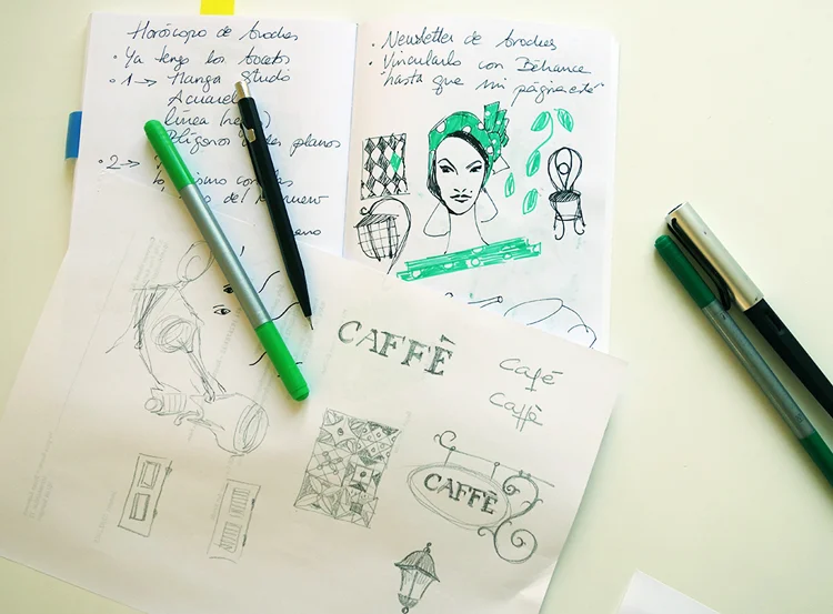
Actually you picture a whole story in the moment you read "Caffè di Roma", don't you? I started researching for inspiration. The mood-board I had got and Pinterest were big help in this phase. I created a secret Pinterest board to collect all kind of images that looked appealing to me and had the vibe of Italian cafés.
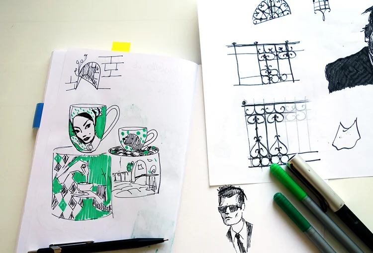
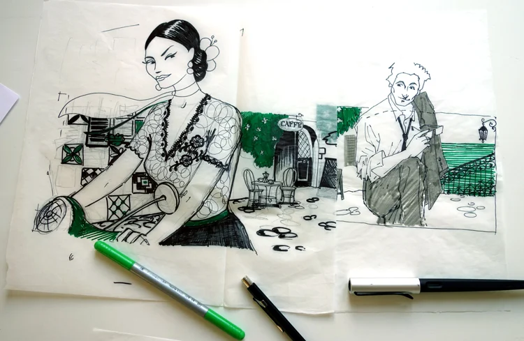
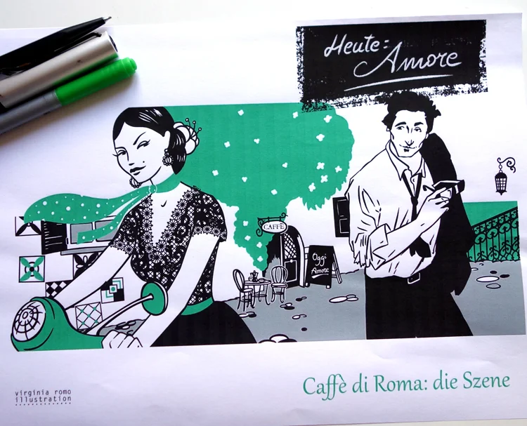
Then I started sketching the first ideas: What if both cups build a scene in the streets of Rome? A woman and a man flirting on the terrace of a café. She riding a Vespa, he holding his sunglasses. Women like Monica Bellucci, men like Marcello Mastroianni started coming to my mind and then to my pencil. What about a more modern version of the Italian type, say an Adrien Brody sort of man.
Ritzenhoff always gives us designers a colour palette to work with. Sometimes it is a very limited and compulsory one and sometimes, like in this case, there are many Pantone colours we can pick from. There are two reasons for this. The first one is to unify the look and feel of a certain collection: They usually bring to the market different motifs from several designers and having some common and matching colours gives harmony to the collection. The second reason is the production of the glasses and porcelain: After their long experience they know which colours look "true" after the complicated process of burning the motif on the glass and which colours cannot go close to each other. Those colours are high end chemical products containing minerals, even gold, and they react during the production process in ways that are not for us designers to foresee but Ritzenhoff takes care of this theme and gives us a "safe" colour palette.
After the first sketches on flat paper I wanted to see how the designs would work 3D, on actual cups. So I cut out the drawings using the template the company had provided us with and I fixed them on some cups I had, which luckily had very similar dimensions to "the darlings". So I could see where there were problems, how the two faces worked together etc. and take the appropriate measures.
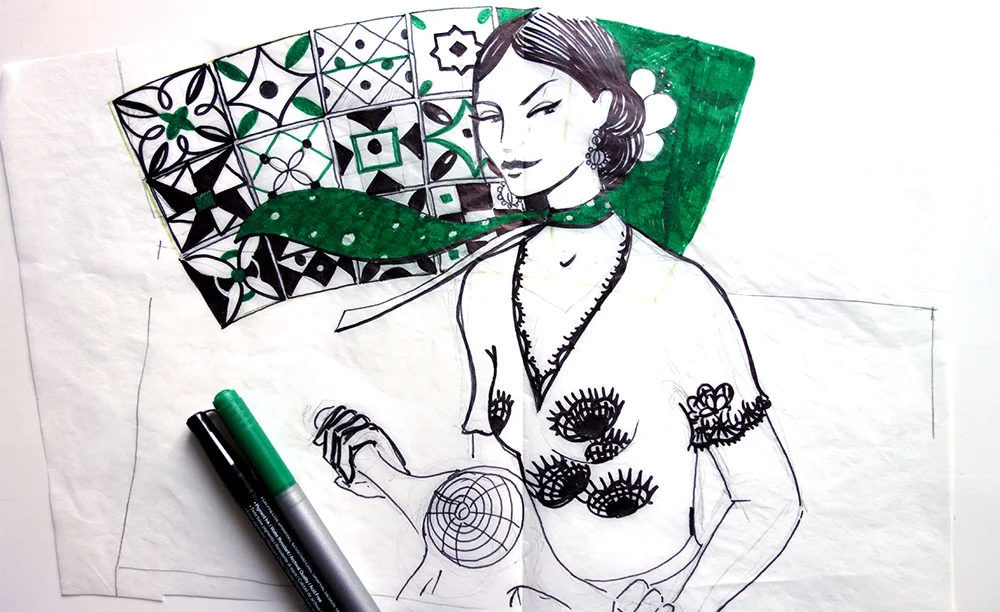
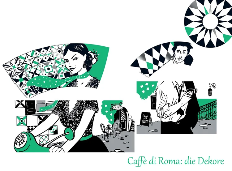
With all that in mind I free-hand drew the final drawing. Which would have two versions, of course: The scene as displayed on the packaging, and then the faces with the "background" they would have on the cups.
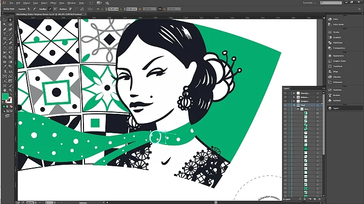
RItzenhoff needs vector graphics for their production. That means we designers have to deliver them eps or ai data. So I scanned my final drawing and started redrawing it on Illustrator. This is a quite long process that requires a lot of detail work, fixing every single anchor point of all lines in the drawing. Yes, I know: that lace blouse and the tiles behind the woman were a little bit suicidal. When everything is finished (like, say, the fifth time when you think everything is finished) you have to "clean" the drawing: there must be no overlapping surfaces, no colour over colour, or it would be a problem during the production.
This is the final scene after having been redrawn in Illustrator...
and these are all the pieces for the two cups and the saucer and the two packages in their flat version, ready to be produced:
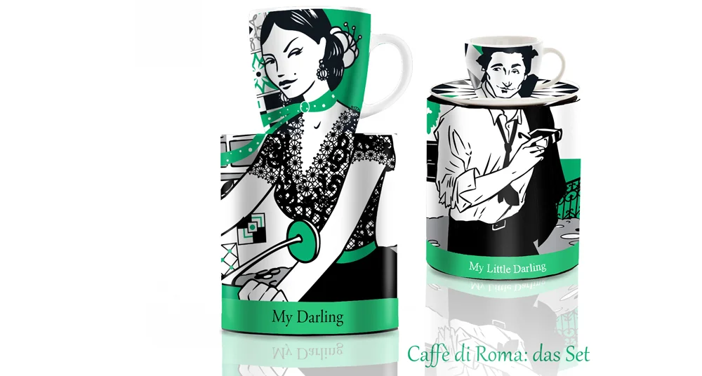
The next step, for me, is to make mock-ups of the pieces. This is not necessary at all but it gives a pretty close idea to the final product and it is almost like having it for real in front of me. It sort of comes to life and is always the most rewarding part of the work. And the shortest one. This is how they looked like:
Then I sent my design proposals to Ritzenhoff. A short time afterwards I received the good news: They would like to licence it. Then comes the contract and some six months later: ta-tahh! The cups are here. And it is always always such a good feeling to hold the final product in my hands and to look my drawings in the eye.
This time the cups came as part of a huge parcel, because they had company: Several other designs I also licensed during last spring. All of them are available through the Ritzenhoff on-line shop and in many German and Austrian household supply stores. Some other day I will tell you about them.
